At the start of the 2018 season, I was out in the bush with a photographer friend, enjoying the early season light and scouting the newly-drying roads to see which areas of the park were becoming accessible.
Towards the end of the morning, we spotted antelopes with their heads up in the distance, so we headed there quickly hoping that they were “pointing” to a leopard or perhaps a skulking hyaena. It turned out that they were watching a warthog crashing through the grass! But, the reaction of the impala was much more interesting to both of us than the subject of their interest!
The reason for this was that the bright light was hitting the antelope from the side, illuminating their flanks and giving them shape. But simultaneously, the background was in deep shade so the contrast between the brightly-lit subject and dark black “canvas” behind was very stark.
Most viewers would see the way that the antelope “stood out” against the background, but might not know how to describe it, or how to tweak a camera’s settings to maximise the opportunity.
In this case, we have a very strong differential light between the subject and background, so photographers need to think about exposure compensation: this is because the camera’s assessment of the scene may be confused or misled by the large and very dark background and try to allow in enough light to illuminate it…leading to an image where the subject, the antelope, is heavily over-exposed. Knowing that this was a likely outcome in this situation, I dialled in an exposure compensation of -1 stop (half as much light as the camera would allow without this change) and took a trial shot.
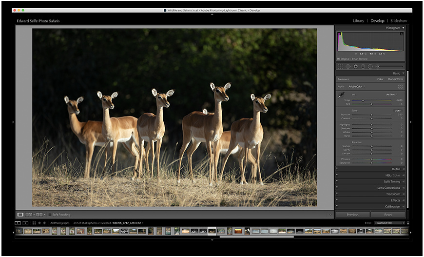
Here is the original image, straight from the camera, and a “mocked-up” image of how it would have looked if I had not under-exposed the image.
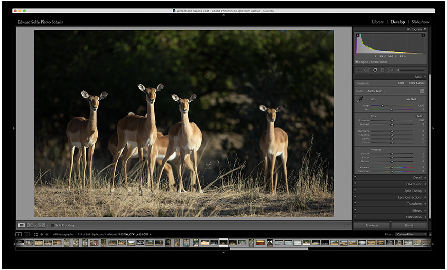
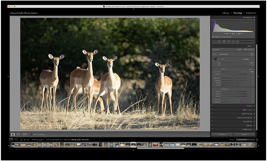
I was lucky; while I tweaked this adjustment, settling on -2/3 stop, the antelope arranged themselves even better! Luckily I had verified my best photo settings in advance so was ready for this beautiful arrangement. Here is the final image, straight from the camera and then in colour and monochrome edited versions.
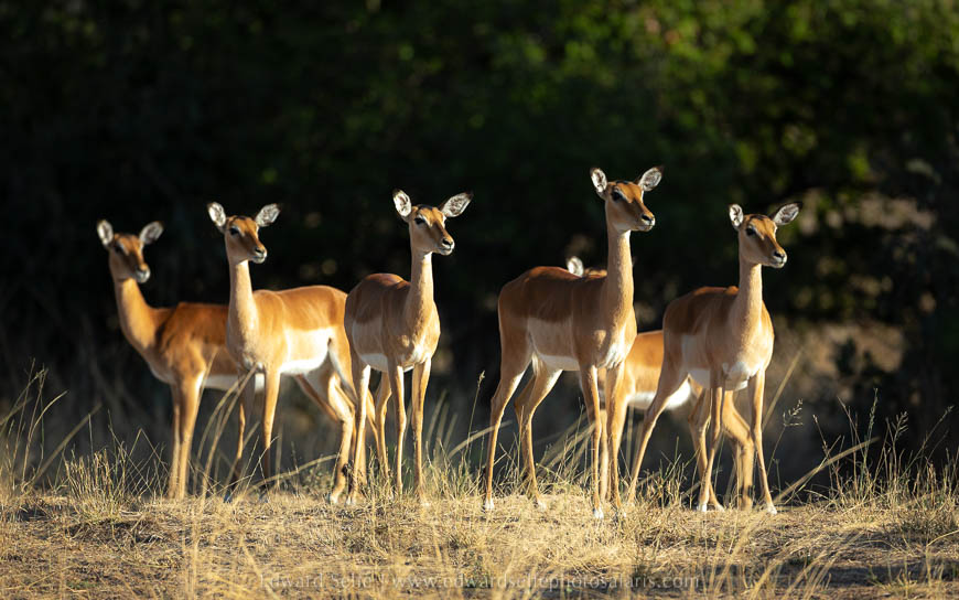
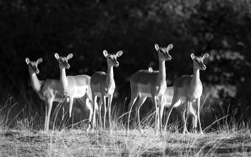
The message here is that when you have interesting, differential light in your image, you need to think about exposure compensation. The more dramatic the light and/or the smaller your subject (in comparison to your background) the more you will need to compensate.

